
Introduction
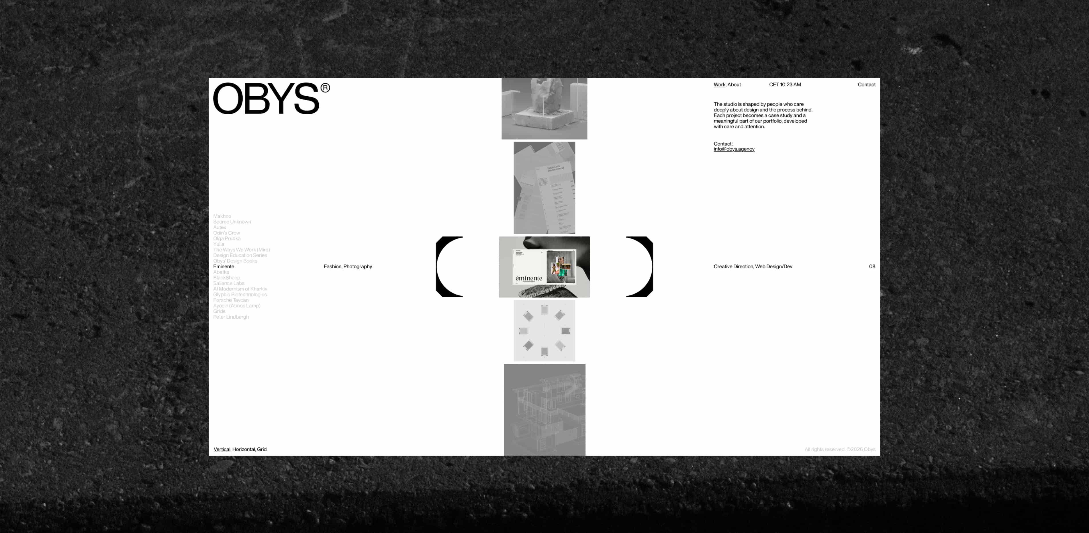
Every studio eventually reaches a point where its own website no longer reflects who they are. For Obys, that moment came after seven years, hundreds of projects, and collaborations with brands across different industries and countries. Over time, our work evolved, our thinking became sharper, and our standards became higher. The website that once represented us no longer felt like an accurate reflection of the studio.
The new website became an opportunity to rethink how Obys presents itself to the world. From a custom typeface and updated identity to a new motion language and content system, every element was designed to work together and create a clearer, more consistent picture of who we are today.
This is the story behind the new Obys.
It started with a typeface
The redesign of Obys didn’t begin with wireframes, layouts, or even the website itself. It began with typography.
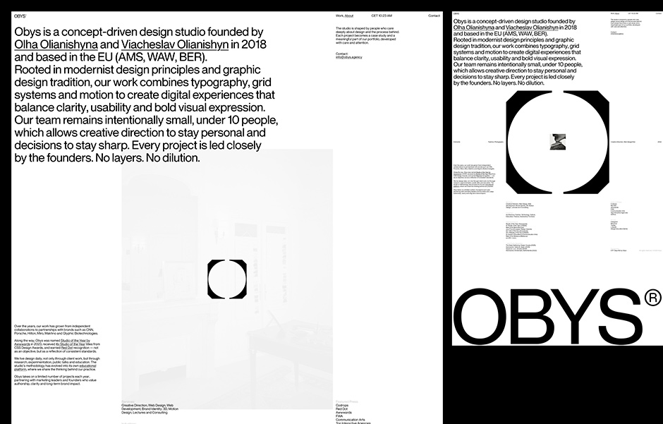
As our studio evolved, we felt the need for a typeface that could better reflect how we think about design today. This led to the creation of OTF Obys NG, a custom neo-grotesque designed to work across both functional and expressive contexts. More than a visual asset, it became the foundation for the entire identity system, influencing hierarchy, spacing, rhythm, and the overall character of the brand.
Once the typeface was in place, the rest of the identity started to take shape. We refined the existing logo rather than replacing it, preserving its familiarity while making it feel more aligned with the direction of the studio. Throughout this process, a simple idea emerged: Obys as a space. A space for projects, experiments, ideas, and different forms of creative expression.
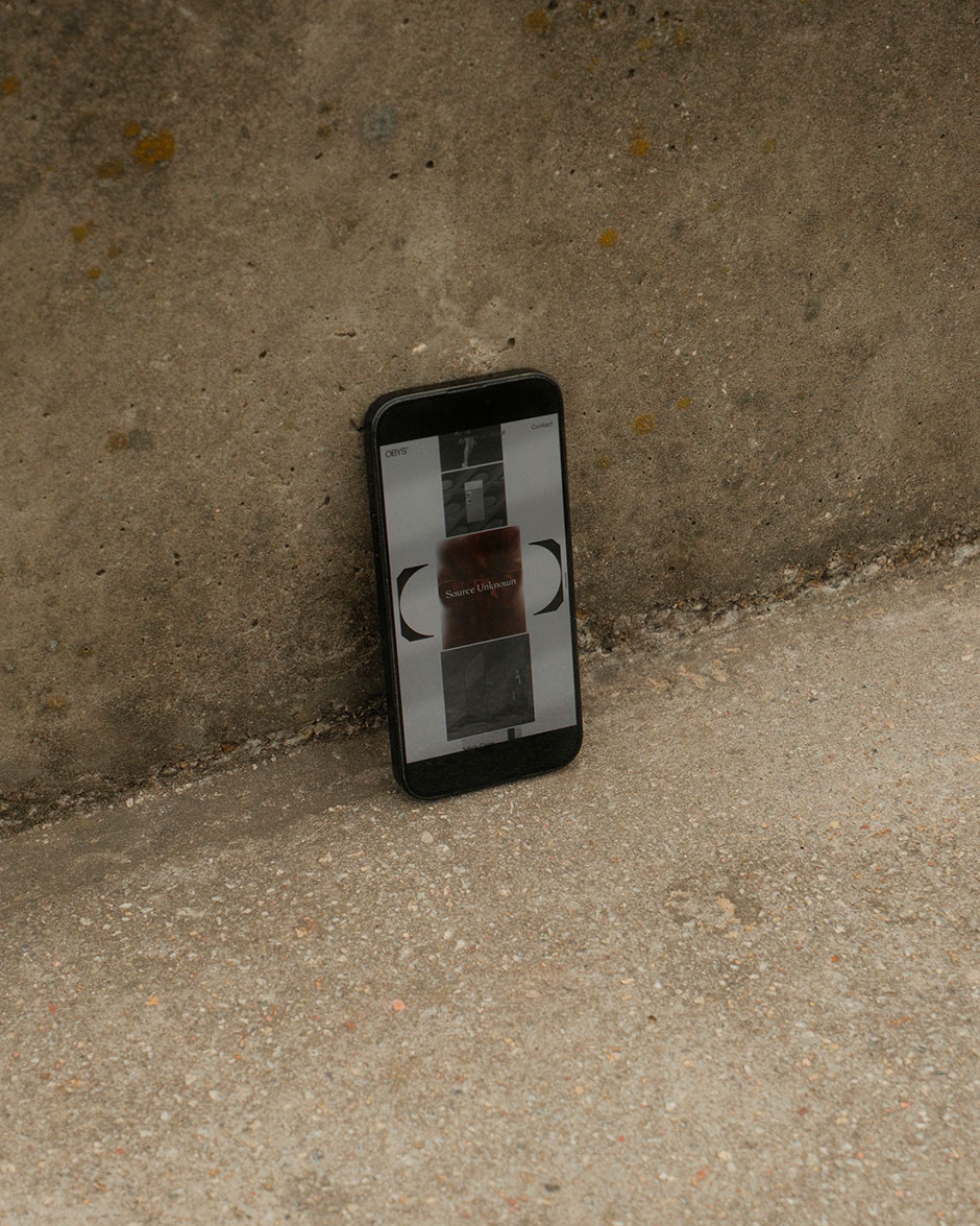
This idea naturally extended into the website. Instead of treating the logo as a static brand element, we turned it into an active part of the experience. It appears throughout the site, adapting to different layouts and contexts while remaining a constant point of reference. Whether browsing projects, moving through pages, or exploring the studio itself, the logo quietly ties everything together.
“Instead of treating the logo as a static brand element, we turned it into an active part of the experience.”
A Website Built as a Space
The website became a continuation of the same idea: a space for projects, experiments, ideas, and different forms of creative expression. Instead of treating the logo as a static brand element, we turned it into an active part of the experience. It appears throughout the site, adapting to different layouts and contexts while remaining a constant point of reference. Whether browsing projects, moving through pages, or exploring the studio itself, the logo quietly ties everything together.
Motion plays a central role. From the very first moment, the user encounters a transformation: from the old logo to the new one, from dark to light. It sets the tone for everything that follows. From there, motion becomes part of the system. It connects layouts, guides transitions between pages, and supports interaction with content. It’s not decorative. It helps explain the idea and keeps the experience consistent across the site.
Choosing What Matters
One of the most difficult parts of redesigning your own website is deciding what not to include. Over the years, Obys accumulated a large archive of projects, awards, experiments, articles, and internal stories. It would have been easy to turn the website into a comprehensive catalog of everything we've done. Instead, we chose the opposite approach.
This version of Obys was designed as a focused introduction to the studio. Rather than presenting everything, we concentrated on what felt most important today: a carefully selected group of projects, a clearer identity, and a more direct expression of how we think about design.
As a result, many things were intentionally left outside the experience. Awards, archives, extended case studies, and additional layers of information remain part of the broader Obys story, but not part of this website.
The structure stays simple. The projects take center stage. Everything else is reduced to what is necessary. Sometimes clarity comes not from adding more, but from having the confidence to leave things out.
“Sometimes clarity comes not from adding more, but from having the confidence to leave things out.”
A system behind the simplicity
One of our goals was to make the website feel as simple and effortless as possible. What started as a temporary space to present a selected group of projects gradually evolved into a more complete, but still highly focused, platform for the studio.
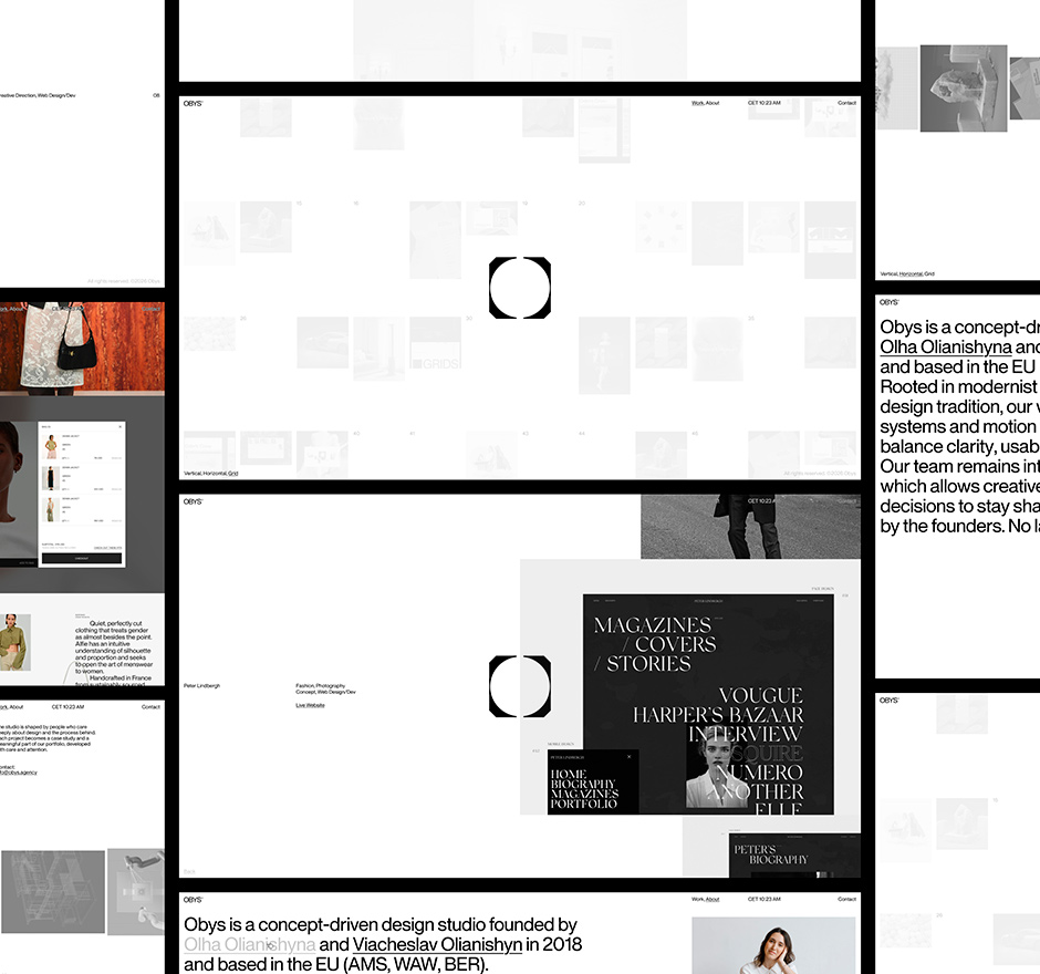
The structure remains intentionally compact. A curated portfolio, individual project pages, and a concise About section provide everything needed without overwhelming the visitor. We wanted navigation to feel natural and predictable, allowing the work itself to remain the center of attention.
Within that simplicity, we introduced flexibility. The portfolio can be viewed in vertical, horizontal, or grid layouts, giving visitors different ways to explore the same content while preserving a consistent experience.
This idea extends beyond navigation. The website is part of a broader identity system that continues across printed materials, presentations, and other studio touchpoints. Motion, transitions, microinteractions, typography, and layout all follow the same set of principles.
What matters most is not any individual feature, but the consistency between them. Every element, regardless of medium or format, is designed to feel like part of the same system.
Technologies
The website was built from scratch using a custom codebase. It is powered by Bun, which serves as both the HTTP server and the bundler. React is used exclusively as a server-side templating engine, without client-side rendering.
All interactions, including animations, virtual scrolling, page transitions, and SPA routing, are handled in TypeScript. Motion is powered by an in-house animation system built on top of Request Animation Frame and the Web Animation API, giving us precise control over every interaction and transition throughout the experience.
Certain visual elements are rendered using native WebGL, while content is managed through Strapi. Styling is written in plain CSS, keeping the system lightweight, transparent, and easy to maintain.
Much like the design itself, the technology behind the website follows a simple principle: use only what is necessary and stay in control of every detail.
Company Info
Concept-driven design studio based in EU. Studio of the Year 2023 by Awwwards.
More about us is here and here.
X: @obys_agency
IG: @obys_agency